
Stop building dashboards. Start asking questions.
Ask a question in plain English. Certant finds the data, builds the chart, and shows the source behind every number.
Example: a question asked in plain English, answered from a table and a document.
Three things that stop people
You have to know what chart to build
You have to pick the chart type before you know what the data looks like, and most people stop there.
You just ask
Type a question, get a chart, then refine it by asking again. It reads your documents and your data together, not only a warehouse.
You have to know which table the numbers live in
Or wait three days for someone in the data team to point you.
It finds the tables for you
Connect your data once and Certant works out how the tables relate and which names mean the same thing. Nothing to map by hand and keep up to date.
You have to trust that the answer is right
And there's no easy way to check.
You can check it
Every figure comes with the row, paragraph or document behind it. Click it and see the original.
A dashboard from one question
Ask "how are warranty claims trending?" and Certant assembles the panels, the joins and the baselines.
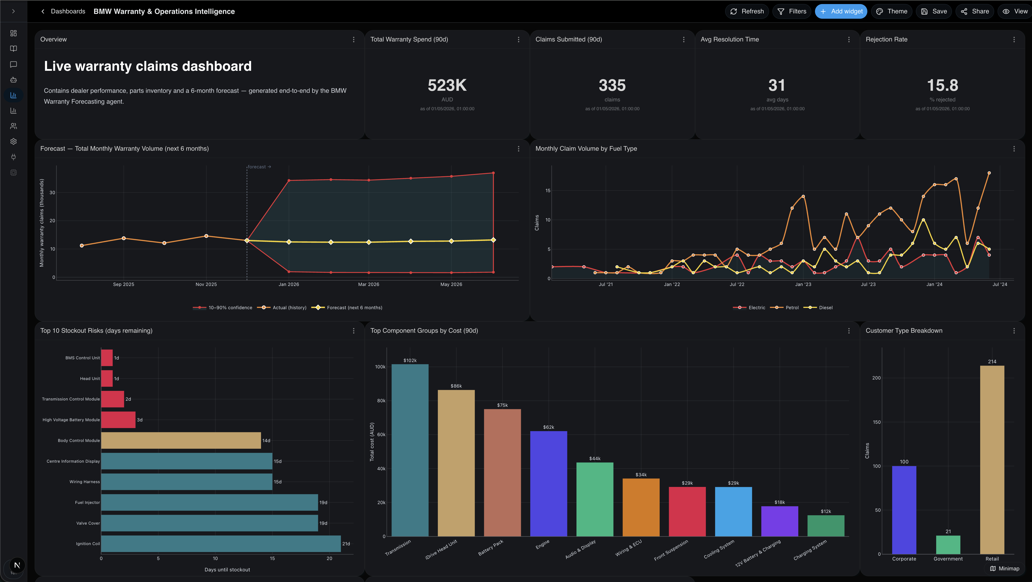
Each number matches a row below; hover or tab a pin for the detail.
Every panel here was chosen by Certant, not placed by hand.
Generated prose that reads from the same query layer as the charts, so it never goes stale next to the numbers.
Single-value tiles with a comparison window, unit formatting and a stamp showing when the value last refreshed.
History, a projection and a confidence band on one line chart. Horizon, model and band width are panel settings.
One line per cohort on shared axes. Click a legend entry to isolate it, double-click to drill into the rows behind it.
Rows ranked by a measure, with bars re-coloured against thresholds you write inline.
Value labels, a sort control and a dimension picker that swaps the axis without rewriting the query.
A thumbnail of every panel on a long dashboard. Click to jump, drag the viewport to scroll.
Apply a dimension once and every chart reflows. Filters resolve through the same joins the panels were built on.
Every chart type, one picker
Six widget types and seventeen chart types, all of them listed below. Describe the data in plain English and Certant picks one, or pin the type yourself.
Six widget types
Seventeen chart types
Line
Trend over time.Multi-line
Compare several series.Area
Cumulative magnitude.Bar
Compare a few categories.Stacked bar
Category totals broken down.Top-N bar
Ranked categories.Pie
Share of a whole.Donut
Share with centred value.Scatter
Relationship of two numerics.Bubble
Three numeric dimensions.Histogram
Distribution of one numeric.Box plot
Distribution across categories.Treemap
Hierarchy / proportion.Correlation matrix
Numeric-column correlations.Forecast ribbon
History + prediction band.Geographic — points
Lat/long markers.Geographic — heatmap
Density by location.The old way and Certant
| The old way | With Certant | |
|---|---|---|
| Building a dashboard | Half a day, a Slack thread, and a BI ticket | A sentence |
| Explaining a number | "The data team will get back to you" | A paragraph, with the source |
| Adding a new question | A new chart, a new request | Just ask |
Built for people without an analyst
Most of our customers don't have an analyst. They have a head of ops, a board paper due Friday and a pile of spreadsheets nobody owns. Where there is an analyst, they stop being the bottleneck.
Click a figure and the row or paragraph opens.
Nobody sees a number they could not already see.
Certant Cloud, your cloud, or fully air-gapped.
Bring a question and your data
Point it at your data and ask the thing you would have asked an analyst.
Revenue fell 36% last quarter, mostly a drop in the ProSeries line after the July supplier outage.